205 Corp.
24, rue Commandant-Faurax
69006 Lyon
France
T. 33 (0)4 37 47 85 69
M. contact@205.tf
Newsletter
205 Corp.
24, rue Commandant-Faurax
69006 Lyon
France
T. 33 (0)4 37 47 85 69
M. contact@205.tf
Newsletter
Augure, designed by Simon Renaud, is based on an a priori paradoxical principal: how to move beyond traditional letterforms without undermining legibility? To this end, this typeface questions the canons inherited from Roman capitals and Carolingian minuscules.
Augure freely reflects a range of diverse influences: somewhere between historical forms of the Latin alphabet (including Uncials), forms taken from cryptography, and forms inspired by digital technology and its rationality. The combinations of elementary forms are reminiscent of early twentieth-century experiments with geometric sans serifs. The juxtaposition of these many borrowed elements provides the typeface with a formal singularity, generating captivating typographic compositions.
Though Augure is also available in a variable font format (weight and slant), the typeface has seven different weights by default (from Thin to Black). The user can thus activate one of the three stylistic sets (classic, eclectic, cryptic) or separately select one of the numerous alternate glyphs contained in the typeface’s extended palette.
Designed by Roman Seban, the modular typeface Bertin is inspired by the work of the famous French cartographer Jacques Bertin and Dutch graphic designer Jurriaan Schrofer.
In 1967, Jacques Bertin (1918–2010) published Semiology of Graphics: Diagrams, Networks, Maps, a fundamental treatise in contemporary cartographic thinking. In this book, he established a series of parameters for representing information, defining six visual variables which he used to construct his graphical system.
In 1973, Jurriaan Schrofer (1926–1990) designed the cover of a reprint of Semiology of Graphics. He proposed a typographic application of Bertin’s graphical system. His typeface, constructed on a grid with a highly rigorous approach, typographically illustrates the six visual variables defined by the cartographer.
With Bertin, Roman Seban presents a synthetic and revitalized interpretation of both the cartographer’s and the graphic designer’s work. Thanks to variable font technology, the different styles of the typeface combine multiple axes of visual variables.
The Bertin typeface can be divided into two families—Bertin Dot and Bertin Square—built with an identical frame, but based on two different modules. Bertin Dot uses the circle whereas Bertin Square employs the square.
Bertin Dot and Square are respectively deployed in 6 styles, based on 6 transformations.
• Size: reduction or enlargement of the modules
• Shape: a horizontal or vertical compression of the modules
• Value: like a gradient, a gradual variation in the size of the modules, from bottom to top or from top to bottom.
• Multi: a combination of the Shape and Value styles
• Rotation: rotation of the modules from 0 to 180°
• Orientation: rotation of the modules towards a common vanishing point
The axes of variable fonts enable a gradual transformation of the modules, allowing users to adjust the desired effect according to their preferences.
The originality of Bertin allows it to be adapted to different use contexts. It is clearly a display typeface: the boldest choices allow for the composition of spectacular titles, whereas more restrained settings ensure legible running text, even in smaller sizes.
Regardless of the variable setting applied, each glyph shares the same metrics. This lets the user overlay the same text composed in different styles and infinitely multiply the formal possibilities.
The CX80 typeface is a “machine”* as rudimentary as it is atypical. Four kinds of serifs are combined in the same font: sans serifs, triangular serifs, sharp rectangular serifs, and smooth rectangular serifs. Each letter can exhaust all possible combinations: up to 256 variations for any one sign!
The user is free to play with the possibilities provided by the typeface. Either they choose to be an iconoclast by associating different serifs (simply using their keyboard), or they may prefer one of the four basic styles that correspond to each of the serifs.
Behind this intentionally economic design, CX80 reveals a unique potential; particularly as weight can be adjusted at will using variable font technology.
CX80 reveals its formal and conceptual sources of inspiration through its modular and composite appearance. The name openly refers to the Codex 80 type classification imagined by Jean Alessandrini** in 1980. Seeking an alternative to traditional classifications, he proposed a new taxonomy adapted to the typographic renewal of the time.
A second influence is the modding of scooters. During the 1980s (when Damien Gautier was old enough to buy his first Piaggio Ciao), teenagers were in the habit of customizing their mopeds by adding functional and decorative elements. This culture of outrageous tinkering and modding also runs through the typeface.
With CX80, Damien Gautier continues his exploration of vernacular typographical forms produced by amateurs and industrial designers. Forms that he loves for their freshness and ingenuity, that here once again show their surprising potential.
* CX80 echoes other typefaces by Damien Gautier: LeChaufferie, Robin, and Heliuum.
** Jean Alessandrini (1942), French typographer, illustrator, and writer.
Garaje takes its inspiration both from the alphabets of the Bauhaus school and the vernacular inscriptions of Spanish garage owners: two worlds that share a desire to reduce typographic forms to simple geometric elements. At the Bauhaus this geometrization is ideological: it represents a rejection of tradition and the affirmation of an objective and rational vocabulary. With garage owners it is a simple matter of logic, certainly due to an ignorance of tradition. It is somewhat naïve to wish to reduce the shapes of the alphabet to elementary forms. Perfect geometrical forms seem less than perfect to our eyes: Type Design abounds with optical corrections that compensate for our perception of forms.
Garaje plays specifically with this paradox: its construction is rigorously geometrical, anchored to a scalable modular grid, with no optical correction. A perfectly objective system, but a typographical aberration, simultaneously right and wrong.
“For the last 20 years, I have extended this family in every direction, to the point of absurdity: extremely narrow or outlandishly large forms, all built from the same modules. Today it is a complete system, available in 44 widths, 5 weights, 445 fonts, hundreds of thousands of glyphs, and no contrast. Resulting in a typeface which is at the same time brutal and playful, rational and naïve.” Thomas Huot-Marchand
Immortel, designed by Clément Le Tulle-Neyret, is a type family with four variants developed according to the Hippocratic theory of humors that explains these latter through the presence of one of the four principal fluids. Each one is the cause behind the development of a character trait: phlegm represents a lymphatic, sluggish, slow character (Immortel Infra); yellow bile, an angry and prideful character (Immortel Colera); blood, a jovial and warm character (Immortel Vena); and black bile provokes hopelessness and melancholy (Immortel Acedia).
This type family is envisaged like a human being, able to reveal different temperaments through the forms that it adopts. Each variant can be substituted for another without causing any change in the bulkiness of the text, as the metric system, which provides a structural link between the variants—set width, x-heights, the length of ascenders and descenders, height of capitals—is constant.
Typographically, each variant is inspired by the work of type designers, following the course of history:
— Immortel Infra finds its source in the work of Robert Granjon, a typeface engraver from the 16th century;
— Immortel Colera in the work of Jean Jannon, an engraver from the 17th century;
— Immortel Vena is influenced by the work of Jacques-François Rosart, an engraver from the 18th century;
— Immortel Acedia takes its inspiration from the engraving Melencolia I by Albrecht Dürer (1514) and attempts a synthesis between two traces of a priori opposing tools, one made by the flat tip and the other by the narrow point. In this sense it is closer to a 21st century typeface.
Immortel Infra and Vena, variants intended to be used with running text, possess two italics: the first, called “Median”, slightly slanted, is ideal for composing long text; the second, called “Italic”, with its very sharp angle and ornate instrokes and terminals, is ideal for emphasis.
To best serve running text, the Infra and Vena variants possess two grades: this signifies that these two variants have two slightly different weights that conserve the same set width so as to have a more or less dark text color according to the page layout and/or the sensitivity of the user. Grade 2 can also be used to compose knocked out text on a dark background.
This type family began life in October 2016 in the Atelier national de recherche typographique (ANRT, Nancy – France). It development was pursued thanks to the support of the Centre national des arts plastiques (CNAP) in 2018.
Could lone typeface with no serifs be enough for a designer? It is the basis of this seemingly uninteresting question that Damien Gautier really got down to work to develop this typeface with its multiple facets. Thanks to the OpenType format, he first developed 4 series. “Standard”: a set of characters that are intentionally all purpose; “Geometric”: a set of characters with elementary forms that bring to mind the first typographic experiments of the Bauhaus; “Modern”: domesticated forms that refer more to characters such as Futura and Nobel; “Grotesk”: here, more designed/drawn forms close to the intentions that were at the origin of characters such as Helvetica or Akindenz grotesk. Four typefaces in one to some extent, accessible thanks to the “Stylistic set” function of the OpenType format.
Originally this typeface contained 4 weights and 7 styles: regular and italic, medium and medium italic, bold and bold italic, black. A fifth weight has been added with a light version. A display version – particularly black – was designed, leading to sometimes surprising choices. This version conserves a number of sets of characters and a certain number of alternative letters.
Finally, the demonstration is made: with a single typeface, we can indeed have many possibilities!
With the efficient and precious help of Roxane Gataud and Corentin Moyer.
Could lone typeface with no serifs be enough for a designer? It is the basis of this seemingly uninteresting question that Damien Gautier really got down to work to develop this typeface with its multiple facets. Thanks to the OpenType format, he first developed 4 series. “Standard”: a set of characters that are intentionally all purpose; “Géométrique”: a set of characters with elementary forms that bring to mind the first typographic experiments of the Bauhaus; “Moderne”: domesticated forms that refer more to characters such as the Futura and the Nobel; “Grotesk”: here, more designed/drawn forms close to the intentions that were at the origin of characters such as Helvetica or the Akzidenz Grotesk. Four typefaces in one to some extent, accessible thanks to the “Stylistic set” function of the OpenType format.
Finally, the demonstration is made: with a single typeface, we can indeed have many possibilities!
Muoto is an extended type family, begun as a collaboration between Matthieu Cortat and the agency Base Design (Anthony Franklin and Sander Vermeulen). Published in 2021, Muoto has now been completed with three new set widths: Ultra Condensed, Condensed, and Extended.
Muoto is the synthesis of a sensitive and human approach to modernist design. This variable sans serif font combines full curves and solid stems, showing that functionalism can actually be warm and softly effective.
With its robust structure and subdued proportions, it evokes organic forms dear to Finnish architect Alvar Aalto, who in 1957 wrote: “we should work for simple, good, undecorated things, but things which are in harmony with the human being and organically suited to the little man in the street.” Muoto embodies this idea while simultaneously responding to contemporary typographic standards with its range of weights (from Thin to Black) and now its four set widths (from Ultra Condensed to Extended), and everything is fully variable!
In 2009, when GVA Studio joined the Base group, it marked the Swiss studio’s entry into a network of international scope. Withtongue firmly in cheek, Base Geneva designed a site to generate posters that played with stereotypes of Swiss style. Basetica “a Helvetica for the 2010s” was designed in this context, commissioned from Matthieu Cortat and distributed by 205TF a few years later.
In 2021, Base Design wished to redefine their typographic identity, and so the studio once again invited Matthieu Cortat to collaborate on a typeface to succeed Basetica.
What came next was a story of debates and questions, of micro-modifications and radical decisions, of discussions and rich debates.
In 2022, Matthieu Cortat began working on a Muoto monospaced extension. By following the same design space as for Muoto, Cortat pushes the limits of the monospaced genre through four width series: UltraCondensed, Condensed, Normal and Extended.
From this program, Muoto Mono family combines original and functional solutions into a coherent system so as to offer designers a typographic tool with greater potential for expression and a wider range of applications. Lastly, the definition
of widths emerges from a typographic and visual logic rather than one based on mathematics, and designers will be able to adjust the set weight thanks to the variable font format.
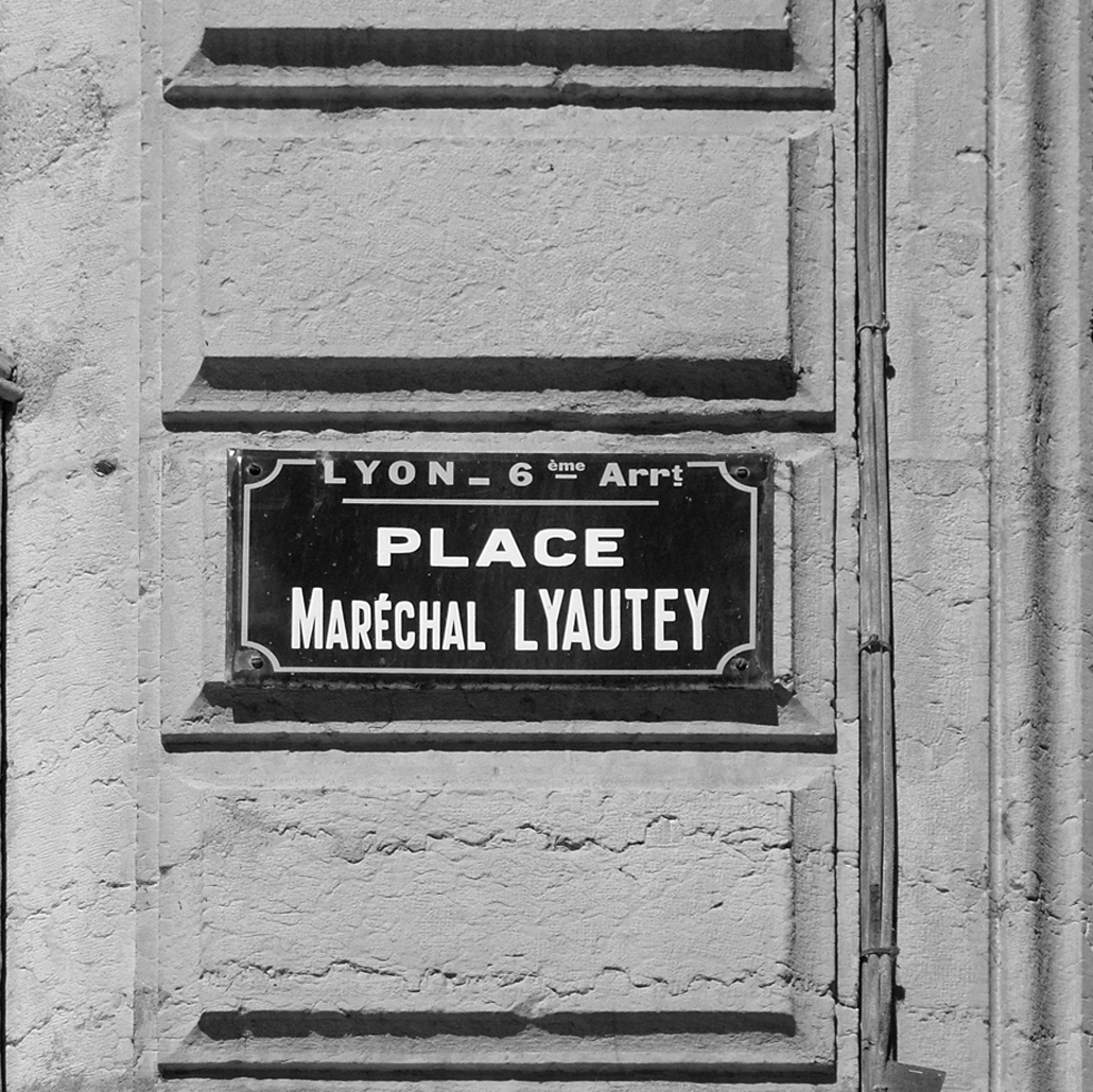
This typeface takes its inspiration from the characters that one can find on the nameplates of French streets. For a long time, Damien Gauthier has been interested in these letters that everyone sees on a daily basis without really knowing them. No one seems to pay them any attention and yet they reveal themselves to be particularly interesting due to their great diversity. Though we can imagine that it is always a question of the same typeface, a closer study shows that a number of alphabets co-exist. One common point: elementary, robust forms, that seem more to have been traced than drawn by a few industrial draughtsmen, eager to be able to compose names of streets, avenues and boulevards in the restricted space of a standardised enamelled plate (well almost, this is France after all!)
It is definitely not a question of smoothing out and unifying all of the drawings finishing with a slick and homogenous typeface! On the contrary, Damien Gautier wants these typefaces to conserve the disparity of the typographic forms that have been noted.
In an apparent logic of organisation and of design that somewhat amusedly reminds us of the method used by Adrian Frutiger for the Univers typeface, the different series of the Plaak conserve the independent designs in a certain number of details (accents, the specific forms of a few letters: G, K, M, Q, R, etc.)
This typeface is composed of 24 styles that display the typographic wealth of this source of inspiration.
“Plaak 1 – Sathonay”: very narrow characters;
“Plaak 2 – Griffon” and “Plaak 3 – Pradel”: narrow characters;
“Plaak 4 – Terme” and “Plaak 5 – Foch”: wide characters;
“Plaak 6 – Ney”: extra-wide characters.
Each serie (from 1 to 6) contains a number of weights and a set of capital and small capitals (because the lowercase letters were almost completely missing from French street signs). By activating the “Ligatures” function, a particular series of ligatures refer to the origin of this typeface…
Thanks to its many variants and its design that is rid of any outdated pastiche, this typeface reveals itself to have a large range of possible uses: press, publishing, signage, visual identity.
An enhanced version of lowercase letters is currently being studied. Its launch is planned for 2018.
With the efficient and precious help of Roxane Gataud.
No font yet!