205 Corp.
24, rue Commandant-Faurax
69006 Lyon
France
T. 33 (0)4 37 47 85 69
M. contact@205.tf
Newsletter
205 Corp.
24, rue Commandant-Faurax
69006 Lyon
France
T. 33 (0)4 37 47 85 69
M. contact@205.tf
Newsletter
Alcalá is based on the “Biblia poliglota complutense” (Polyglot Bible of Alcalá). It was the first edition of a complete polyglot Bible, as well as the first printed version of the New Testament in Greek (Septuagint) with gloss. Conceived between 1502 and 1517, it was produced under the patronage of Cardinal Francisco Jiménez de Cisneros.
The first drawings of Alcalá go back to 1995. A second version started in 2011, commissioned by a publisher for a French
and Malagasy edition of the Bible by J.N. Darby. Alcalá was developped in three styles: roman, italic and bold. Today, a new cut is added: Alcalá Black Display, its intended to compose titles and headings.
Alcalá has all requested qualities for editorial design, especally newspaper and magazine layouts. Its sharp design guarantes high readability, space saving and smart printed rendering in small sizes, as well as a great look in bigger uses. Look at its alternative punctuation! For book design, Alcalá Roman contains titling capitals and its Italic contains a serie of special ligatures.
While other characters has extended families, Damien Gautier decided to develop a reduced one. Alcalá has the only the cuts you need!
As every 205TF typefaces, Alcalá has an extented Latin glyphset which allows to compose many languages.
Battling is a geometrical lineal, inspired by the “Universals” that were distributed by the Dutreix foundry in Limoges in the 1930s, and that were probably intended to compete with the Europe (the French name given to Paul Renner's Futura) in the field of the “modernist” sans serifs. Battling is a robust typeface that conserves the awkwardness of its original model. It possesses a sort of “adolescent vigour”, frustrated and rowdy.
Matthieu Cortat has produced Battling in four weights (light, regular, medium, bold) with their corresponding italics. In medium and bold, it avails of a series of uppercase titling characters, decorated with a thin thread of light. It also possesses a series of roman numerals in small capitals.
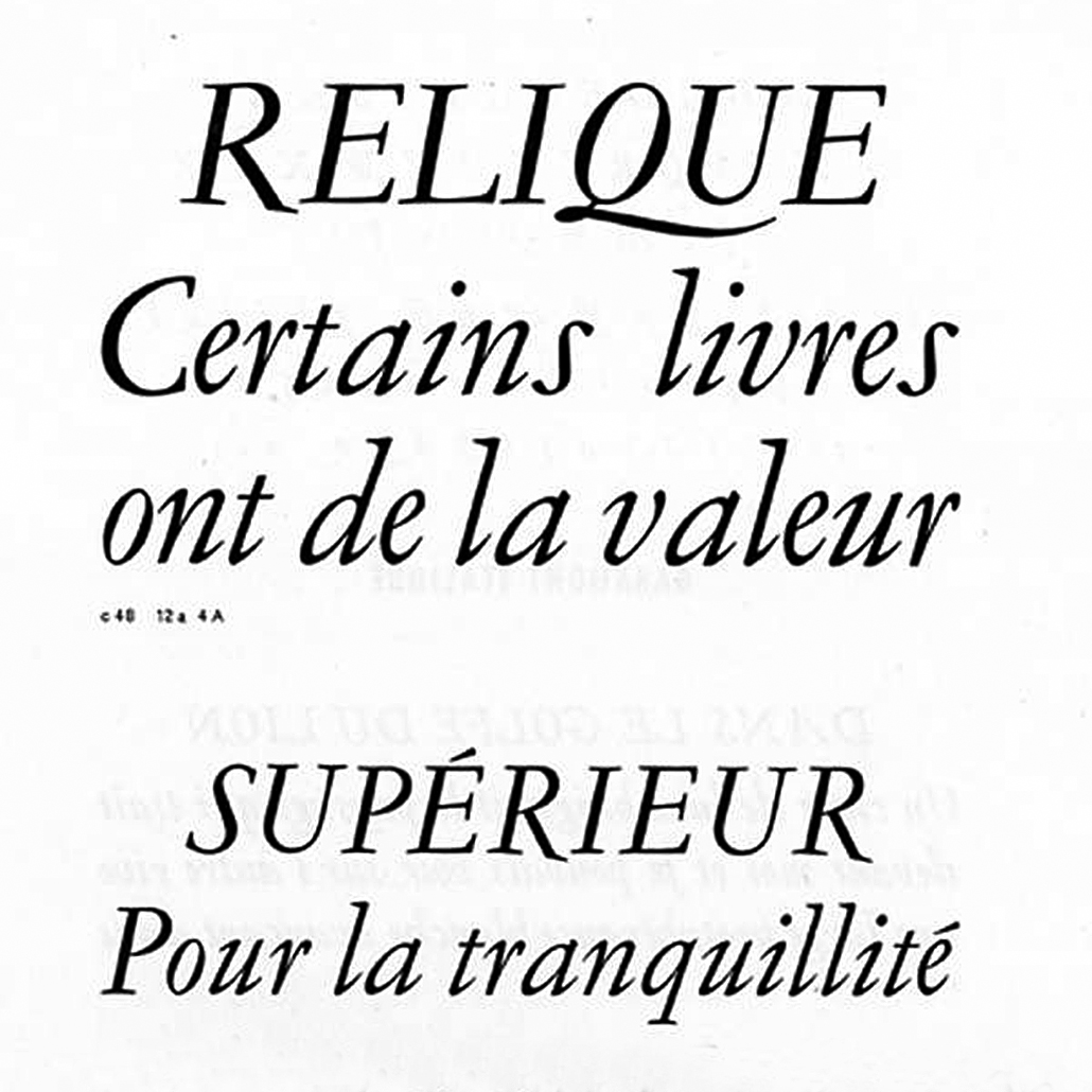
With the Henry typeface, Matthieu Cortat provides a personal interpretation of the Deberny & Peignot foundry's Garamond, engraved by Henri Parmentier between 1914 and 1926 under the direction of Georges Peignot.
Its authors sought to recover the grace of the typefaces of Claude Garamont, while at the same time taking into account the reality of the modern paper industry, that uses wood based papers and not cloth based ones, as was the case in the 16th century. Henry is based on medium type sizes (9 to 14) of Parmentier's engraving. It is a quite slim Garalde, a little narrow, lean and slender. We feel an inspiration that is almost “Art Nouveau” in its z that leans towards the left, its winding a and J, the lower loop of its heavily curved t, the ample loop of its Q… These features are still visible in the italic with its changing rhythm and it s joyous ligatures.
Henry is a delicate typeface. Its design precise if not a little dated.
Immortel, designed by Clément Le Tulle-Neyret, is a type family with four variants developed according to the Hippocratic theory of humors that explains these latter through the presence of one of the four principal fluids. Each one is the cause behind the development of a character trait: phlegm represents a lymphatic, sluggish, slow character (Immortel Infra); yellow bile, an angry and prideful character (Immortel Colera); blood, a jovial and warm character (Immortel Vena); and black bile provokes hopelessness and melancholy (Immortel Acedia).
This type family is envisaged like a human being, able to reveal different temperaments through the forms that it adopts. Each variant can be substituted for another without causing any change in the bulkiness of the text, as the metric system, which provides a structural link between the variants—set width, x-heights, the length of ascenders and descenders, height of capitals—is constant.
Typographically, each variant is inspired by the work of type designers, following the course of history:
— Immortel Infra finds its source in the work of Robert Granjon, a typeface engraver from the 16th century;
— Immortel Colera in the work of Jean Jannon, an engraver from the 17th century;
— Immortel Vena is influenced by the work of Jacques-François Rosart, an engraver from the 18th century;
— Immortel Acedia takes its inspiration from the engraving Melencolia I by Albrecht Dürer (1514) and attempts a synthesis between two traces of a priori opposing tools, one made by the flat tip and the other by the narrow point. In this sense it is closer to a 21st century typeface.
Immortel Infra and Vena, variants intended to be used with running text, possess two italics: the first, called “Median”, slightly slanted, is ideal for composing long text; the second, called “Italic”, with its very sharp angle and ornate instrokes and terminals, is ideal for emphasis.
To best serve running text, the Infra and Vena variants possess two grades: this signifies that these two variants have two slightly different weights that conserve the same set width so as to have a more or less dark text color according to the page layout and/or the sensitivity of the user. Grade 2 can also be used to compose knocked out text on a dark background.
This type family began life in October 2016 in the Atelier national de recherche typographique (ANRT, Nancy – France). It development was pursued thanks to the support of the Centre national des arts plastiques (CNAP) in 2018.
The Kelvin typeface is the culmination of a sensitive thinking around a modern aesthetic in typography. It is expressed through two stylistic axes — with and without serifs — with both being based on two historical ideas of modernity. Even though their designs are not based on the same skeleton, Kelvin Avec and Kelvin Sans are tied together by a common philosophy, that of building as opposed to plotting or drawing. Each one is accompanied by an italic and a titling version in which their inherent characteristics find themselves exacerbated.
Kelvin Avec takes its inspiration from typefaces which appeared at the beginning of the 18th century, attached to the family of traditional serifs. Its main reference is the Romain du Roi whose creative process is divided into two stages: a conceptual study which is then followed by an adaptation of the designs during the engraving of different sizes.
The Kelvin Sans pays tribute to the typefaces which appeared at the beginning of the 20th century and that we connect to the family of geometrical sans serifs. The observation of typefaces created by Jakob Erbar, Rudolf Koch, Edward Johnston and Paul Renner along with typefaces from promotional advertising documents from the epoch, came to nourish the design process of the Kelvin Sans.
In 1846, Lyonnais printer, Louis Perrin commissioned founder Francisque Rey to engrave a series of capitals inspired by monumental roman inscriptions. They would go on to be used in the composition of work on the Antique inscriptions of Lyon, by Alphonse de Boissieu. In 1855, the typeface was completed by a number of lowercase fonts; certain bodies came from the stocks of Rey, others were drawn by Perrin himself. His “Augustaux”, one of the first “revivals” in the history of typography, became rapidly successful, launching the “Renouveau Elzévirien” (Old-style Renewal) movement. With Louize, Matthieu Cortat provides a contemporary reinterpretation of the Augustaux. It retains a wise and serene tone, the grey of clear text, the soft roundness of the curves. Louize is discreet, calm, harmonious.
Available in three weights, Louize has a number of small capitals (for the roman styles) and ornamental capitals (for the italics).
For use in titles, Louize is available in a Display version. This sharp and clear variant is inspired by letters engraved in stone. It brings a new contemporary freshness to this timeless typeface. The Display variants also offer, in the roman styles, a series of ligatures inspired by that of concise engravings.
After the success of Louize and Louize Display, Matthieu Cortat completes the elegant Louize Family with Louize Display Condensed available in three weights: Regular, Medium and Bold.
In 1846, Lyonnese printer, Louis Perrin commissioned founder Francisque Rey to cut a series of capitals inspired by monumental roman inscriptions. They have been used to compose “Les Inscriptions antiques de Lyon”, a book by Alphonse de Boissieu. In 1855, the typeface was completed by series of lowercase, some coming from the printshop of Rey, others designed by Perrin himself. His “Augustaux”, one of the first “revivals” in the history of typography, became rapidly successful, launching the “Renouveau Elzévirien” movement.
With Louize Family, Matthieu Cortat provides a contemporary reinterpretation of the Augustaux. It retains a wise and serene tone, a clear grey of text, the soft roundness of the curves. Louize is discreet, calm, harmonious.
For use in titles, Louize is available in a Display version. This sharp and clear variant is inspired by letters carved in stone. It brings a new contemporary freshness to this timeless typeface. The Display variants also offer, in the roman styles, a series of ligatures inspired by stone cutters traditions. Those features also appear in the condensed cuts.
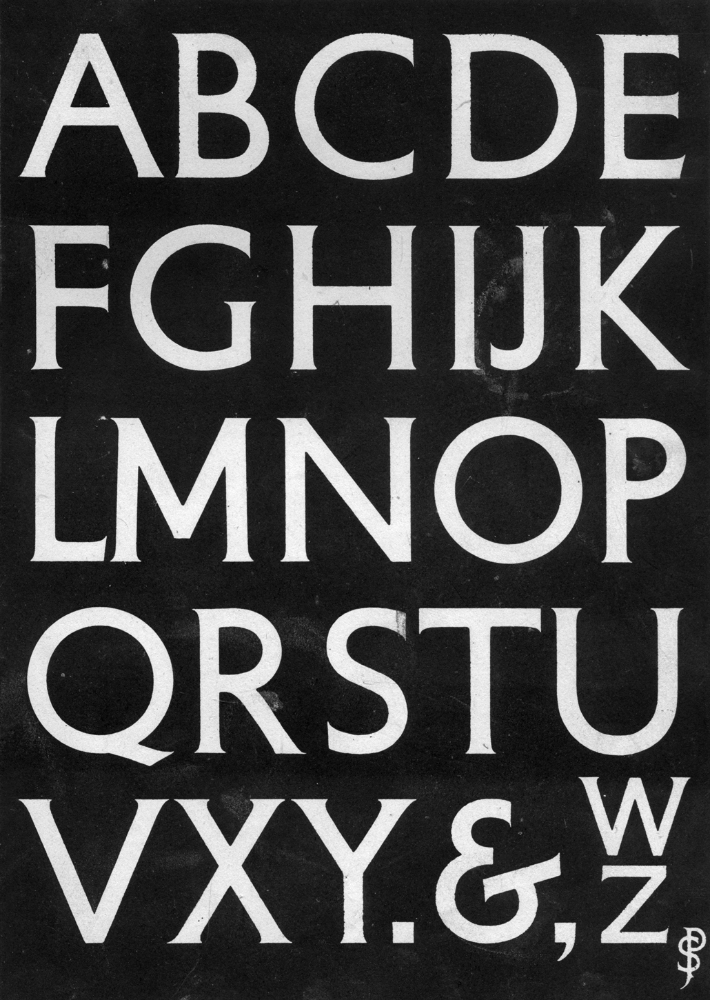
For the Petit Serif typeface, Matthieu Cortat was inspired by lettering created by Percy J. Delf Smith for the building located at 55 Broadway, s.W. 1, London, that he reproduced in his book, “Civic and Memorial Lettering*.
This typeface is a lineal of monumental roman capitals with classical proportions, that possesses very slight serifs due to the use of brushes in its creation. A character used for titles and shopfronts, it does not possess a lowercase, but is available in Greek and Cyrillic alphabets. The letters A and I have variants available for Basque.
Percy J. Delf smith R.D.I., Civic and Memorial Lettering, Adam & Charles Black, London, 1946.
Romain 20 is a well-rounded and clear-cut interpretation of a French elzevir, revisited to suit twenty-first century taste. Designed by Alice Savoie, the family is released in 2020 after 8 years in the making.
Romain 20 is a contemporary adaptation of a metal typeface originally named “Romain Vingtième siècle”, distributed by the French Fonderie Allainguillaume at the very beginning of the twentieth century. Savoie stumbled across the typeface in a 1902 edition of the journal La fonderie typographique and was immediately seduced by its texture on the page.
The typeface features a unique combination of flavours, with some attributes that are very much reminiscent of French publishing and jobbing work of the period. Soft bowl terminals are balanced by sharp bracketed serifs. The typeface combines a certain idea of French elegance with a hint of Art Nouveau frivolity.
The typeface was initiated as a revival of the text cuts of the roman and italic styles. A bold and a bold italic were later added to the family for greater versatility. The generous and sturdy proportions of the regular and italic styles have been fine-tuned to be optimal at text size, while the bold variant can prove particularly efficient in display. The italic retains generous proportions, making it fairly comfortable to read in continuous settings. The bold is particularly dark.
Type design: Alice Savoie
Typeface development: Fátima Lázaro
Font mastering: Roxane Gataud
Salmanazar is a typeface which has its roots in nineteenth century French type design, and in particular, the specimen of Antique Warnery no.1, published in 1922. Originally intended to be used for the composition of titles (the smallest body size being 20pt), its undecided yet vigorous strokes have been updated for contemporary use, while retaining its typically strong details from the belle-époque typefaces. Indeed, Salmanazar has a distinctly crafted look, with its own unique characteristics such as its vertical proportions, and its increasingly unusual contrast in the grotesque landscape. Its asymmetrical counters, and slightly heavy weights impose a certain darkness and a particular flavor in continuous reading, bringing to mind American Gothics, such as Franklin Gothic or the German humanistic sans serif Ludwig. Industrial in style, this typeface features a range of 4 weights, along with their corresponding italics. Each weight reveals a subtly different behavior, and this makes it suitable for different purposes.
Stockmar is Matthieu Cortat's interpretation of a baroque typeface by Johann Rudolf Genath II (1720). Originally available in three different italics (more or less geometrical, more or less cursive, more or less dynamic), it has been modified so as to obtain a “new engraving”, easier to use, with only one italic.
Rough, robust and aggressive, it can be applied to many different uses, whether meticulous or “everyday”. It remains nonetheless a character for body text, designed for use in books. The Stockmar numbers are uniquely of the old-style kind, in proportional and tabular variants.
The Stuart typeface possesses the general forms and proportions of a 15th century Venetian kind. Matthieu Cortat designed it with a calligraphic reference in mind giving it a classic, regular sobriety. Its general appearance is nonetheless resolutely contemporary. Its italic is inspired by the first italics of Alde Manuce and Francesco Griffo: barely slanted, its axis of inclination varies only slightly. Stuart is available in three weights, along with their corresponding italics.
A bookish body type, it is available in a number of optical bodies for increased legibility. Stuart Titling (for sizes larger than 14 points) is narrower, its downstrokes and upstrokes are more stated. As for Stuart Text it suits mid sized bodies between 9 and 14 points. Stuart Caption, larger and of solid build, is for use with bodies of 9 points and under.
Yorick is based on a monospace typewriter font (model 3402U) found in the Campionario caratteri e fregi tipografici (specimen book) of the Nebiolo typefoundry, dated 1920 – but the font might probably be older. The source is a slab serif form very common in typewriter fonts (Pica, according to Olivetti naming system) with a little touch of classical flavour from the Imperial style (i.e. with thick and thin contrasts). Start in 2016, Yorick keeps the essence of the original design, and avoid to make it look too digital or constructed. It’s a gentle industrial font: a font of engineers in Oxford shirt and tweed suits, not in white blouse. A precision tool with eleganza torinese, not showing off. Its italic is a proper one, not a slanted roman. It comes in a simple family of 4 styles, but with a large character set which includes bot Latin and Cyrillic scripts — each completed by localised alternates for Romanian, Moldovan, Serbian, Macedonian and Bulgarian.